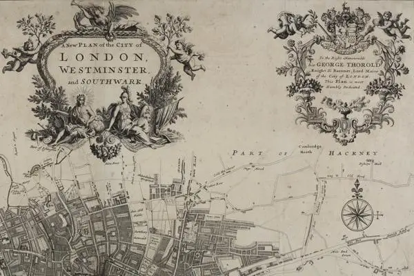
Decorative maps of London
The Project
The Metropolitan Map collection at LMA is a major collection of maps which form part of the core collections at LMA. They are mainly printed and are an important source for documenting the history of London and its environs. The aim of the Metropolitan Map project, now in its second year, is to catalogue the maps in order to make them easily available to researchers.
Decorative maps of London
The Metropolitan Map project has allowed us to not only catalogue and make available for research many hundreds of maps, but it has also allowed us to look in more detail at the maps within our collections. Here project archivist Amy Proctor draws attention to some of our more decorative maps.
The earliest maps of London were drawn in the decorative bird’s-eye or map-view style, providing a pictorial plan of the area that they were depicting (for example, the so-called ‘Agas’ map - see the Layers of London website). The Great Fire of London in 1666 prompted a shift towards presenting the City in plain plan form, but cartographers continued to include decorative details, symbolic figures or views of important buildings in their works, often either in the margins or within areas of the map which were largely depicting open, undeveloped spaces.
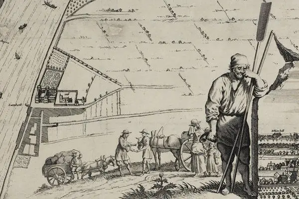
Decoration on maps allowed the cartographer to not only produce an item that was visually appealing but also to convey a message about the city that they were portraying. The illustration of the mournful figure, traditionally associated with being either a waterman or a baker on Frederick de Wit’s, ‘Platte Grondt der Stadt London’ overlooking the city in flames conveys a sense of the personal loss and emotional toil of the devastation of London (London Picture Archive: 30626).
One of the most decorative maps produced of the City after the Fire is that by John Oliver, published in about 1680. John Oliver, a master mason and glass-painter, was appointed as one of the City’s ‘sworn viewers’ after the fire to assist in the rebuilding of the City. Oliver’s map is one of the few post-fire maps to depict buildings pictorially and it is mentioned in the diary of Robert Hooke that Oliver consulted with both Hooke and Christopher Wren to ensure the accuracy of his map. The map conveys a message of a rebuilt and prosperous City. The stretch of the River Thames from the Pool to London Bridge is crowded with commercial shipping vessels, and an illustration of Father Thames reclining against an urn spilling fishes into the water symbolises prosperity. The City arms appear on a shield held by Mercury, who is traditionally associated with trade and commerce, and the message of London as a mercantile city is supported by the other symbols such as globes, maps and trophies. The figures of the Swordbearer and Macebearer stand proud at the side of a table which provides a key to significant places. The map was re-issued in c.1690, 1726 and for a final time c.1728 largely unchanged, although the last edition does include in plain plan form the addition of areas around Hanover and Cavendish squares (First edition LPA 30284). It provides an interesting companion to the more widely known maps by John Ogilby and William Morgan published in 1676 and William Morgan’s map of 1682 (these two maps can be viewed on the Layers of London website).
Reflective of the importance of the River to London, the figure of Thamesis or Father Thames appears on several maps published in the seventeenth and eighteenth centuries. In addition to the map by John Oliver, later examples include the plans of the cities of London, Westminster and the borough of Southwark published by William Faden in 1785 (LPA 31044) and the map of John Fairburn, published in 1795 where the figures are used to decorate the title of the maps (LPA 31054).
As John Oliver used Mercury, other mapmakers also included emblematic or allegorical figures on maps. Putti (chubby male children) appear with some regularity, providing a decorative and playful element to the maps. Joannes de Ram, ‘Londini Angliae Regni Metropolis…’ in the first edition (published c.1690) is abundant with such figures with putti in clouds crowding the Royal arms and carrying the City arms, and a scene of six putti holdings garlands of fruits and flowers; a globe, books and a framed crown nestle amongst them with a backdrop of rolling hills and trees rich in foliage. The map is also decorated with the portraits of William III and Mary II and below is a panorama of London, the river rich in shipping vessels. The map conveys the impression of a commercially active, peaceful city (LPA 30638). It was published a further three times, although the decorative aspects of the final edition (c.1729) bear little resemblance to the first, amongst the notable differences are the removal of the portraits of William III and Mary II and the replacement of the panorama of the City with a view of Westwood Park in Worcestershire. Another map conveying a message of peace and stability was published by Johann Baptist Homann in c.1710; it includes an image of an angel with a trumpet and olive branch (the traditional symbol of peace) over the post-Union Royal arms of Queen Anne (LPA 30646).
John Strype’s 1720 map of London included three ornamental cartouches showing the figures of Victory, Apollo and Athena, putti, oak and laurel branches, and swags of fruit and flowers (LPA 30650). This was just one of several maps showing all or part of London which were included in Strype’s updated edition of John Stow’s, ‘A Survey of the Cities of London and Westminster’ (first published in 1598, revised and re-published by John Strype in 1720 and again in instalments between 1755 and 1757). Samuel Parker’s map of the same year also included similar cornucopia, merchandise and symbols of medicine, the law and the arts (LPA 30653).
Towards the end of the eighteenth century decorative and symbolic adornments to maps of London became less common. As London grew there was less room on maps for decoration as previous areas of undeveloped fields and open spaces became subject to urban development. For example, the area of St. George’s in the Fields in Southwark was often filled with decoration or tables of places, but from the 1750s new roads cut through the area and it was rapidly developed, and it was that detail rather than the decorative that new maps needed to feature. This demand for maps to show the most up to date metropolitan improvements also led mapmakers away from the decorative to producing works which clearly showed the expanding City, the new network of docks to the east, the grandiose squares and parks to the west, and the new infrastructure cutting through London in the form of the canals and railways. Decorative maps became reserved for those promoted as souvenir or tourist maps or as an advertising tool for businesses.